Friday, July 28, 2006

Kern, baby, kern

“Anyone who says money can’t buy happiness, doesn’t know where to shop” is not a sentiment I ever felt inclined to agree with… until I stumbled across Veer.com and their decidedly tasty ‘Kern’ zip-up.


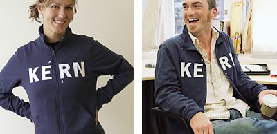
A ‘kern’, (in case you’re unaware) is a ‘light-armed Irish foot-soldier’, a definition which relates to the KERN on my top in absolutely no way at all. ‘Kern’, in this finely-stitched, twill appliqué context, relates to the act of manually adjusting the space between letters, so as to create even optical spacing across a word, as helpfully demonstrated by our attractive (trust me) model below. (And have I been taking crazy pills or is my top better kerned than the one on the female model above? I certainly think so.)


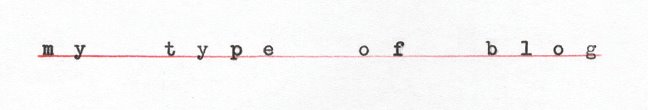
Letters don’t overlap, by default, as each character sits within its own little rectangular box, somewhat like letter tiles in Scrabble. This works well enough with letters that fill their space, but, as you can see in the example below, when letters like ‘V’ and ‘A’ sit next to each other, large negative spaces are created that cry out to be closed up.


And if I’d been workin’ on that plastic bag, I’d have been happy to oblige, as kerning is one of my Top 10 favourite things. Hence my excitement over my zip-up top that since it arrived has yet to make it to the wash. I mean, what if I need it and it’s not yet dry?! Come on. Kerning’s just so satisfying. It’s like scratching an itch, or getting that piece of apple peel out from between your teeth. Not kerning is like putting up a picture and not worrying about whether it’s hung straight. Clients don’t like kerning as it takes time and who the hell cares? “You can still read the word ‘VACUUM’ can’t you? Get it to print, Princess!” Bunch of savages in this town. Every town.

The really great thing about this top is that for the first time in my life I’m having conversations about kerning that haven’t been started by me! People see the word and just have to ask what it means, which, while I have no complaints, I do find somewhat surprising. I would have expected people to assume it was just some brand like 'FCUK' or ‘GAP’, and not even think to ask, but they do.

Incidentally, ‘Godfreys’ in the sample above is set in ITC Serif Gothic Heavy, designed by Herb Lubalin and Antonio DiSpigna in 1974, and ‘The Vacuum and Cleaning Specialists’ is ITC American Typewriter, designed by Joel Kaden and Tony Stan, also in 1974. (Maybe Godfreys has a thing for 1974?) ITC Serif Gothic, (if you're thinking it looks familiar) was also used for the Style ‘A’ poster for a little film that was released three years later in 1977. Star Wars and Godfreys. There can’t be many other things those two have in common? Oh wait, I can think of link between the prequels and vacuum cleaners! But besides that…?

Thursday, July 13, 2006

Their days are numbered

The other day I happened across these hand-painted numbers over the entry ways to the Melbourne Brewing & Malting Company’s Ale Stores.


There appears to be no door 1 or 2, and the number over 14 had been completely worn away, but the rest were there to be seen. I've posted a large image, so click on the link to view them up close. The numbers are spaced across the two horizontal white strips above the roller doors in the image below.


Erected in 1883, the building is just a shell now, but it’s on a large empty block that I imagine will be developed eventually. I’m sure the building will be worked into whatever development springs up, like the Shot Tower in Melbourne Central, but I can’t imagine these old numbers will survive.

I love a good bit of hand-painted lettering (and indeed, numbering), although to my eye the lower-half of the ‘8’ seems a bit squashed, like a tomato that’s been left out in the sun. Would’ve been a fun day’s work painting these, and the artist clearly loves a good 3D effect. Although I can’t quite work out what’s going on with the sort-of white shadow beneath the relief. Almost looks like an even older set of numbers than these ones were painted over?

Despite their worn state, the gold paint still gleams, and when the angle was right the winter sun really made them sparkle. Who needs backlit signage when you’ve got the sun and a specific angle at a certain time on a cloudless day?


If any sort of development gets underway I’ll post an update, so stay posted. Although not too posted, because I don’t imagine anything will happen soon. And, to be honest, when it does it’ll most likely just be a photo of newly applied whitewash anyway, so… you know, can’t wait for that one.

UPDATE (12/12): Well, there's movement at the station! Or an announcement, at least. RMIT has sold 1.6 hectares of the old CUB site to Grocon, and retained 0.3 hectares for the development of their own "significant and innovative academic building". As predicted, Daniel Grollo pledged, “The heritage aspects of the old Malthouse building and the bluestone facades fronting Bouverie Street will be incorporated into the development," but made no specific mention of the old hand-painted numbers. Surely an oversight? The article also says the CUB brewery was demolished in 1989, and RMIT bought the site from the government of Nauru in 1998 for $25 million (which is a lot of Student Union fees).

Here's a picture of the site as of October 2006. Mr Google, please let me know if I'm infringing your copyright by reproducing this image here. It's still on your servers, so it hasn't moved too far from home. Yours sincerely, etc, etc.

Friday, June 09, 2006

Typecast

The other day I was chatting with JJ, and I told him that I felt like I’d been neglecting ‘My Type of Blog’ lately and that it was time for another post. He asked (because he’s a clever-bottom) if it would be an anti-dog post because that seems to be all I can write these days.

Showing great forbearance, I told him ‘no’ because I didn’t think type and dogs really related to each other. He started rambling on about how anti-dog posts didn’t fit on a cat-blog either (um, earth to JJ, hello?) and blah, blah, blah, but I’d already stopped listening because he’d just given me an idea…


Well there’s type on it, isn’t there? I love this sign; with its fading and its rust, and its little painty/stickery/whatevery thing that it looks like someone’s used to try and obscure the ‘NO’ with. Fight the power, brother (or sister). I also really love the stylized dog. Classy little illustration. And on-topic, I can even tell you the font is Folio Bold Condensed. I thought it was some sort of condensed Helvetica at first, but the counters didn’t seem right. I only have Helvetica Black Condensed, so I assumed it must have been an Ultra Condensed version, but someone at Typophile suggested Folio, and they were right. It’s not a typeface I’ve had anything to do with before. Here’s a comparison for you if you’re interested. If you’re not, close your eyes, lower your chin a nad, then open them again and continue. Nice.


I’ve got quite a collection of ‘No Dog’ signs that I’ve taken over the years. I’ve often felt like I should do something with them, but I’ve never known what. Looking at the sort of fonts they use seems like as good a thing to do as any? So here’s another one for you.


These two images are somewhat mysterious. I stumbled onto them while wandering through the images on my Mac a while back. I did not take them, I have no idea who did, and I have no idea how they got onto my computer. All I know is that ‘City Walls’ was taken on June 6, 2004, while ‘Perros No’ (Spanish for ‘No Dogs’) was taken on October 13, 2004, and that they were both taken with a Canon IXY Digital 500. As it’s the same model of camera, I assume they were taken by the same person, most likely on the same trip. I suspect that ‘City Walls’ was taken in England, so ‘Perros No’ may well have been taken in Spain. Although four months is more than enough time to travel to any number of Spanish-speaking countries, even by boat.

I can only assume that someone thought of me when they saw the signs (I’m flattered), took a quick shot, and then passed them on, but I cannot remember who it was. If it was you, let me know, won’t you?

Well, sleuthing for a phantom photographer has even less to do with type than dogs do, so I might leave it there. Until, of course, I’ve had time to delve into my photo albums to dig up some more images to add to these two. Hehe. Bye for now.

Monday, April 10, 2006

Rushall Muse

Anyone got any comments on this picture?

Saturday, March 11, 2006

Typo Tour: Nuttelex

In Richmond we stopped at the home of my margarine of choice: Nuttelex.


Not only the only margarine that isn’t grey before colour is added (according to a checkout chick that my Mum was chatting to once), it also has the best logo of any margarine out there: a little squirrel with a satchel and cap. I love anything that gets around with a satchel. And a cap. Although I’m not sure why s/he needs either? A satchel would come in handy when you’re out collecting nuts, I guess, but it looks more like he’s heading off to school than out to forage for food. And the nut he’s leaning on wouldn’t fit in his satchel anyway.

I’m not sure what typeface they’ve used for ‘Nuttelex’. The X is very distinctive, but the only font I could find with a similar one was Clarendon Bold Expanded, and it clearly isn’t that.

I was also interested in a small sign by the roller door.


For some reason the ‘R’ in ‘Beware’ has gone missing. Maybe due to a similar problem as that of the zookeepers in Pete & Dud’s ‘Topical Fish’ sketch, who complain that in the winter their Rs keeping blowing off? Whoever got the job of fixing the sign has apparently been unable to find another regular Helvetica ‘R’, but was able to scrounge up a bold ‘R’ from Helvetica Condensed. It’s only a slight touch, but it gives the sign a more personable feel that I like.

I also like how you’re being warned to beware of - not just any trucks - but specifically Frize trucks. People just wouldn’t have taken a warning about trucks seriously, but FRIZE trucks, well why didn’t you say?! That missing F adds weight to the warning, as though it failed to heed the sign’s message and paid the price. The careless glyph has been carted away, but a grey stain of metallic blood remains as a cautionary tale of misadventure. Actually, with just the O there, the message seems like some ol’ sea dog’s warning, “Arrr, set sail if ye will, but mind ye beware o’ Frize Trucks!”


Around the corner of the building is a brightly backlit collection of fonts, including Herb Lubalin’s geometric, slab-serif ITC Lubalin Graph Bold (1974), Eric Gill’s Gill Sans Extra Bold (1931), and what is most likely a hand-drawn painters’ script that has been made into a sign. If you like that style of script, a whole swag can be found for purchase here and here.

Tuesday, January 10, 2006

Typo Tour: Melbourne Sporting Precinct

One spot not on the Typo Tour was the Rod Laver Arena. Surprisingly. Not. I love a good bit of Futura, (with the exception of the Extra Bold), but I’ve never liked the signage for the Rod Laver Arena; and not just because it’s got ‘Rod’ in it. Though that doesn’t help.


The Extra Bold ‘Laver’ knee-caps the whole thing before we’ve even started. Look at it. It’s like a big ol’ beached whale, too bloated and heavy to haul itself back into the water.

I find the negative spaces around the three ‘A’s and after the ‘V’ to be awkward and jarring, disrupting the rhythm of the letterforms. And like bark peeling off a tree, the ‘Arena’ looks ready to come adrift and just fall apart.

You could possibly improve things by increasing the space between all the letters, but mostly I think they should have just chosen another font. And name. I liked Melbourne Park. I thought it was fine for both the complex and centre court. Nothing against Our Rod - he could hit a ball really well apparently - I just prefer another name over his.


Anyway, we didn’t stop at the Rod Laver Arena on the Tour, but we did pass it as we drove through “Melbourne’s Sporting Precinct” on our way to Richmond. As we passed the MCG off in the distance, someone commented on its lack of visible signage. There was nothing to see at all. In fact, the MCG itself was actually quite hard to see (above). I guess that during the day the structure is so large it’s hard to miss, and when there’s a game at night, well, you can see the glow from the moon, but given the extent to which the Rod Laver Arena and the Vodafone Arena are lit up, even when they’re not in use, it struck us as odd that the MCG didn’t have so much as a single bit of visible branding.


I didn’t think anyone missed an opportunity for self-promotion these days. Maybe the MCG’s reputation and stature is such that it doesn’t need something as low and crass as artificially illuminated signage? Maybe to name “it” would be to diminish “it”? Whatever “it” is? It’s certainly one of Melbourne’s most well-known icons. Whatever the reason, I kind of like it. It seems kind of dignified, or something. It doesn’t scream at you; just gives a quick nod of the head as you pass in the hallway. Almost like it’s one of those inner-city bars, tucked away down an alley with nothing but a small name plate over its door to indicate where it is. Except the MCG covers several city blocks and attracts tens of thousands of people… but apart from that it’s the same. Sort of. You’ll find it if you want to go. Nice.

Sunday, October 16, 2005

My Type of Mum


A couple of years ago I got a birthday card that came in this envelope with my name in hand-rendered type. The question down the bottom in my Mum's handwriting reads, "Do you know this font? I think it's called The Fat." I love it.

Typo Tour: Nylex Plastics

At 7:24 on the morning of June 29, 2005, after 14 months of restoration costing $300,000, the Nylex clock was back on! And jammed. Time was standing still. Some sort of computer error. Fixed eventually, but now, mere months later, like some dodgy string of blinking globes around a Milk Bar sign, it's already lost lights again. Nylex's promise of "Every Time" now reads "Ever Time", which I find kind of amusing. Not as amusing, of course, as the time that I saw a glowing Red Rooster sign where the light had gone out in the 's', but "You'll tell the grandkids" experiences like that only come along every so often! In addition, the outlined 'N' in Nylex is also missing in action, so $300,000 well spent then.


I've never quite understood the appeal of the Nylex clock. I don't understand why it holds such a special place in the hearts of the community. It’s just a piece of corporate signage, isn’t it? Very old corporate signage, sure, but corporate signage none the less. It’s a nice treatment of the Nylex logo, with the lights and all, but if McDonalds or Nike rendered their logo in lights and bunged it on top of a silo for 44 years, would people be as enamoured? What's so special about Nylex? Do people just love their plastics so much that they now view Nylex as family? I guess people could love it because they've grown up with it as a part of the landscape, and now it's an icon of their childhood, or years gone by, or something?

So, what about the old Foxtel sign that used to sit below the Nylex clock? People hated that Foxtel sign. They weren’t even impressed by its enormous size, which you would have thought would count for something, given our love of Big things here in Australia. If the Foxtel sign had stuck around for 44 years, would opinions have changed? Would it have worked its way into our hearts, to the point that the general public would’ve been happy to pay to have it maintained? Would people view it with the warmth of nostalgia, and speak of it fondly like an old friend? Why is Nylex better than Foxtel?

Incidentally, the Foxtel sign was the largest sign in the Southern Hemisphere, and so bright that at night it lit up the rooms of the houses opposite it like day time. A friend of mine who worked for Foxtel told me that the residents took the company to court over the sign and its nova-like brightness. Telstra eventually came to an out-of-court settlement where they supplied every affected home with new, extra thick curtains! Creative thinking.

So Foxtel didn't last but Nylex is still there. Maybe it's because Nylex is representative of our inner suburban, working class roots? It represents all the factory workers who lived and toiled in Richmond before it became fashionable and expensive? The sign doesn't represent a company and its products, but a local narrative of hard work and hard conditions. Could be; it's not a history I can say I know much about.

Tuesday, October 11, 2005

Roadwork on the right

There's a road sign on the way to Ballarat that's always caught my eye, and on the weekend I finally stopped to get a photo.


I've never seen a Roadwork Ahead sign where the text is aligned on the right! How good is it?! I love it. And before you start stomping around in your size 12s, I'm well aware that it's just a normal sign with the "1km" removed, but take a second to dream with me, won't you? I think all road signs should be like this. I think this sign creates a sense of movement and of being on the road. Although maybe in this case the message should be to slow down, so centred would be better, but where the message is about speeding off, let's go for right alignment! Much more dynamic, lovely sense of movement. Might be confusing for right to left reading cultures, but it is in English, so if they don't know English it'll be confusing anyway. So no harm done. Right alignment. Good one.

Tuesday, October 04, 2005

Typo Tour: The Graham

I went on a Typo Tour around Melbourne on Sunday night, after attending a Typography Forum at Fed Square the night before. Organised by Stephen Banham of The Letterbox and Andrew Budge of Designland, the Tour was excellent; two bus loads of typeheads, taking in 26 typographic sites around Melbourne. The only problem was that it was held at night (to avoid traffic, I guess) and most of the sites would have been better viewed in daylight. So I didn't take any photos to post here while on the tour, but over the weeks to come I hope to go back to most of the sites and get some good shots.

Here's one of "The Graham", an old hotel on Swanston Street that closed down years ago, but whose signage remains. The building is now occupied by the Melbourne Sports Depot. Such a beautiful script, and such a beautiful canvas.


I love the name "The Graham" for a hotel. It reminds me of the greatly missed 'Gary' milk from a few years ago. A bold marketing idea that apprarently never clicked with the public and went the way of the late lamented Mars Milk. RIP. I tried to send a positive message to the manufacturers by buying as much Gary as possible, but it was too sweet, even for me, and I just couldn't keep it up.


I would have loved to have sipped a Gary at The Graham. Sadly, not to be.