Saturday, May 23, 2009

The Meaning of Everything.

Just finished reading The Meaning of Everything – The Story of the Oxford English Dictionary by Simon Winchester. Crammed with a cast of larger-than-life characters and overflowing with drama, intrigue and political machinations, it really was a cracking read. Not the book for everyone, though, if the man I met at a party yesterday is anyone to judge by. After recovering from his shock that such a book existed – and that anyone would want to read it even if it did – he told me it had been nice to meet me and excused himself to get another drink. Bunch of savages in this town.

The book is mostly focussed on the content of the dictionary, the story of the words themselves, but no chronicle of the dictionary would be complete without reference to the type:
The book is laid out in three columns, each essentially ten inches tall and two-and-a-half inches wide. The body type is a classic British Imperial-era face called Clarendon, which had been designed and the punches cut in 1845 by Benjamin Fox for Robert Besley at London's renowned Fann Street Foundry: it used boldface for the headwords, and then a variety of styles (light and italic among them) and a variety of fount sizes for the various elements that [the editor, John] Murray decided required illustration. The definitions are set in Old Style; the quotations in a smaller fount size of the same.

I've always had a soft spot for Clarendon. I think it's a dependable face, with surprising versatility. When auditioning fonts for a new job I'll often bring Clarendon out onto stage, just for a look, and I'm often pleased with how it performs. May pass in the end, but it's always worth a look.

It was a footnote to the text quoted above, however, that really caught my eye:
Robert Bringhurst, an authority of typography, says that the suite of Clarendon faces 'reflect the hearty, stolid, bland, unstoppable aspects of the British Empire. They lack cultivation, but they also lack menace and guile. They squint and stand their ground, but they do not glare.'
That simply is one of the finest descriptions of a typeface I've ever read. I love it. It shows how type is so much more than mere marks on a page; it lives, it breathes, its character speaks with a voice all its own.

A favourite application of Clarendon is on the many street signs in South Melbourne for Clarendon St. Total coincidence, of course, as all the street signs down there use Clarendon. Well, did. I think. When I ventured down to get a shot for this post, the only street signs I could find used either Saa Series C, (commonly used around Australia for highway signage):


... or the ever contentious Gill Sans.


I was sure I wasn't making the street signs up though, as it was quite a distinct memory. I wandered the streets hoping to find a lone survivor, overlooked and tucked away down an alley or something. I noticed South Melbourne market was covered in Clarendon, and that gave me hope. But instead of searching the skies for a sign, I should have been looking a little closer to the ground. Dotted around the intersections along Clarendon St are these handy way-finding installations...


...err, bins, and it was there that my Clarendon-Clarendon connection lived on. Good to see that though change may have come to the signs of South Melbourne, true to its character, Clarendon stood its ground. Long may it be so.

UPDATE
A FontFeed post from a little while back linked to a Flickr pool called 'LTypI: Lack of Typo­graphic Imagination' which collects logos where the name is reflected in the choice of type. I wouldn't go so far as labelling them unimaginative as I think it's coincidence more often than not, and besides, I quite enjoy the type-nerd in-jokes. :)

UPDATE 2
Speaking of fonts having character, as a follow-up to their Font Conference video, College Humor have just released Font Fight. Not bad, although I question their portrayal of Helvetica. She's all spunky and casual, and anything but the middle-aged scientist in a white lab coat that I would have imagined. Oh well, make my own damn movie, then, I guess? :)

Sunday, February 22, 2009

App scene gets xheighting.

There's never been a better time for type-loving iPhone-owners. Three apps that have recently caught my eye are:


FontShuffle from FontFont: a handy application to "browse, view and print approximately 650 original typefaces from the international font vendor on your iPhone or iPod touch."

WhatTheFont from MyFonts: an iPhone version of the popular and incredibly useful WhatTheFont service, that allows you to photograph, upload and identify font samples, all from your iPhone. All instances I've tried it on so far have been correctly identified, which is impressive. So great when you're out in the street and can't wait to get back to your computer to find out what that font is.

KERN from Formation: a kind-of Tetris for typophiles, where you position the missing letter of a falling word into the correct position, scoring more points the sooner you lock your position in. Poor placement results in the deletion of one of five ligatures (lives), and once all five are gone, the game is up. Although technically not kerning as such, it's still a game that tests your sense of space and rewards a keen eye, and I'm Kerning at home, I'm Kerning at the gym... can you believe how much I am in heaven? And while my skill at the game seems to be improving (current highest score: 401.69 from 58 words; highest individual letter score: 23.42), I can't see much real-world benefit, as I've rarely encountered words randomly falling down the screen when typesetting, even when using Quark.

Can't wait to see what's coming next.

UPDATE
Just scored a 24.33 point letterdrop! Still can't top 401.69, though. More as this develops! :)

Tuesday, December 09, 2008

Horizon of Mortality.

I wouldn't call myself a Bond fan, as such, if only because to me the film franchise grew increasingly unimaginative and derivative as it hulked along, but I did quite enjoy 2006's Casino Royale. It seemed like a fresh start, (somewhat ironically, given it was the third screen adaption of the novel), and it seemed to have some soul to it. It wasn't simply going through the motions, playing to expectations and clinging desperately to the long established formula.

In addition to the script, a small detail of Casino Royale that I enjoyed was the promotional logo from the poster, which cleverly worked the iconic '007 pistol' into the film's title, which is set in Century Gothic).


And it's a device I see they've used again in the title for this year's Quantum of Solace, which is set instead in House Industries' popular Neutraface.


The composition's a little awkward, but it works well enough. I wonder if perhaps this will become part of the Bond brand, necessitating the inclusion of at least two Os in all future titles? I imagine not, but now that they've got a run-on (two's a run-on, a run-on of two), I hope so. Although not if it proves so restrictive that Bond titles fall back into the predictable keyword mix 'n' match of the past: A View To A Kill, Licence To Kill*, The Living Daylights, You Only Live Twice, Live And Let Die, Tomorrow Never Dies, Die Another Day... BINGO! It was like self-parody at the end there. Um... Time/Space + Life/Death = New Title! Next?

And so it was a pleasant surprise to hear the latest Bond offering was to be titled Quantum of Solace. Um, sorry? Quantum? Of Solace? Who uses those words anymore? Who even knows what that title means? Brilliant!

All of which compounded the disappointment in then hearing the hyper-talented Jack White had written the theme song and called it... Another Way To Die. Groan. Jack, you're killing me! I never thought you could be the weak link in a chain. If you had to tread old ground, couldn't you have called it Fell In Love With A Spy?

I haven't seen the film yet, so no idea how it compares to Casino Royale, but hopefully the logo isn't the best thing about it. And hopefully we'll see the Double-O device again when James Bond returns in...


Horizon of Mortality? Hey? How's that for title? Ticks all the boxes: Distance of space + Reference to death + Double-O condition = GOLD! And Avenir seems like an obvious enough choice for the face. I guess only time (or the IMDb) will tell...

* Yes JJ, the original title, Licence Revoked, would have been much better. :)

Tuesday, October 21, 2008

Mad Type.

I spotted a few of the typographic anachronisms in the otherwise wonderful Mad Men (especially that glaring Lucida Handwriting in the opening titles), but Mark SImonson got the lot. Great post.

Wednesday, August 06, 2008

Quicksilver.

One of the great things about Typohile.com is that from time to time the designers of the many and varied under discussion will pop up and chime in themselves. As happened in this thread where Dean Morris, the designer of Letraset's Quicksilver (1976), stopped by and gave a brief little history of his iconic, love it/loathe it typeface.

Great read.

Tuesday, August 05, 2008

I have found the exit!

Clever use of type in the underground carpark of Melbourne's own Eureka Tower. Shame the choice in typeface, Helvetica Neue Bold, wasn't as creative.

Wednesday, July 23, 2008

Font Conference.

Crossed north-east arrow, rotated black square, black square, black square, upward-pointing arrow in a rectangle!

Hehe.

Tuesday, June 03, 2008

Darth Vader.

Only you could be so bold. Hehe.

And under that mask I reckon he's pretty grotesque as well.

Monday, June 02, 2008

Putting a Typeface to a Name.

Two posts concerning the fonts chosen for the identities of the three main contenders in the US Primaries: Non-Fontogenic from H&FJ and McCain's Optimum Look by Steven Heller for The New York Times.

I'm a bit late to the party with these links, but as the Primaries are still underway it's sorta kinda still topical. Of interest, anyway. Although judging by the comment string on Hellers' piece, that's up for debate. At least one commenter considers choice of typeface to be akin to discussing how a candidate coordinates their tie with their shoes. I take their point, but I disagree. Typefaces can have character and can communicate values, and in these identities they haven't been chosen at random or because they were already installed on the receptionist's PC. No, they were chosen very carefully, very deliberately, and at the very least they can tell you how a candidate wants to be perceived, which, taken within a broader context, can be revealing.

I wouldn't recommend voting for someone based upon their choice of typeface (although if anyone turns out campaigning with my beloved Decorated 035 I might have to reconsider...), but, as I say, that doesn't mean it's a discussion that can't be of interest, or even of value.

UPDATE: Only related through the clever pun in the title, but Change We Can Believe In is a post from H&FJ on the new face of British currency. Stunning.

Sunday, April 27, 2008

Mind yer Ps and Qs

... and your Os, Gs and Cs too, apparently. Hehe.

Monday, March 19, 2007

Trainstationsignagespotting

I’ve written elsewhere about the pleasure to be found in collecting. Doesn’t really matter what; as long as it’s not sea shells or infectious diseases. I’m not sure when my collection compulsion began, but certainly by age 11 it was in full swing. On a four month family trip around Europe and North America, I did the typical kid thing of collecting a sew-on patch or sticker from every country and major city that we visited. Not so typical though was that I also collected sugar. Sugar sachets, sugar cubes, sugar straws; all the many and varied forms went straight into my pockets, and with the help of my sister I returned to Australia with several bulging shopping bags full of sugar. I’m not sure what my parents were thinking? I guess at least it kept us quiet.

I’m not sure I can explain the appeal of sugar. Maybe seeing a common, everyday item with unfamiliar words like ‘Sucre’, ‘Zucker’ and ‘Zucchero’ printed on them made it seem exotic? More likely it’s just because they were everywhere and (importantly) were free. Also free were the many cardboard beer coasters that I collected when we were travelling around Germany. My parents were quite happy to encourage an interest in German beer coasters, but German beer itself would have to wait for another time.

I returned to Germany with Kate in January 2005 for a capital week in Berlin. I loved Berlin. If I had to pick a place to live in other than my beloved Old Melbourne Town, Berlin would be very high on the list. I didn’t collect any beer coasters this time, but as we bombled around Berlin, I found myself engaging in a spot of bahnhof beschilderung bespritzend, which in English translates to ‘train station signage spotting.’ Although, as we’re talking German, perhaps that should be 'trainstationsignagespotting'?

Related to trainspotting, though without the street cred only Ewan McGregor climbing out of a filthy toilet can bestow, trainstationsignagespotting was not a hobby I’d ever considered before. And it only occurred to me now as I noticed, to my great surprise, the range and variety in type and form across the many signs dotted around Berlin’s rail network. I wouldn’t have expected der Volksdeutsche to tolerate such disorder and lack of conformity, but maybe that’s just a stereotype? Certainly it’s a stereotype the story of the Ampelmännchen would appear to confirm. Although also refute, I guess. Aren’t we humans funny that we can grow nostalgic for the symbols of an oppressive regime? And yes, as the owner of an Ampelmann t-shirt, I know I’m not helping.

But anyway, there they were, and I no complain. I thought the variety was wonderful and the depth of history it implied was remarkable. Unfortunately, as we were only there for a week, a few days had gone by before I really noticed, but I photographed what I could in the time I had left. (And also the time that the long-suffering Kate was indulgent enough to allow, as she stood arms crossed, foot tapping, waiting at the station's exit.)

And so, here, for the benefit of all maknkind, is my collection of Berlin’s Train Station Signage (work in progress, hopefully) with type identification where appropriate.

Friedrichstrasse 1: First up on Friedrichstrasse is good old dependable rock, nothing beats Helvetica, which is unfortunately all we have for our rail signage here in Melbourne. A system wide re-brand in 2003, and what typeface do they choose? Only the most ubiquitous typeface of all time that says nothing about Melbourne except, “We wish we were Europeans.” Missed opportunity. Absolute tragedy.


Friedrichstrasse 2: This is apparently a custom font designed for the Deutsche Bahn by Henning Krause of MetaDesign, which has since been replaced by a new superfamily from Erik Spiekermann and Christian Schwarz.


Hallesches Tor


Hansaplatz


Nollendorfplatz


Potsdamer Platz 1: I love a tasty slice of blackletter, and this sample — a simplified form of blackletter known as Schaftstiefelgrotesk — is a cracker. It’s so sturdy and expressive and, I think, the perfect visual representation of the German language which, as a lover of the German language, I mean in a good way.


Potsdamer Platz 2


Stadtmitte 1


Stadtmitte 2


Stadtmitte 3: This is FF Transit, designed by MetaDesign in the early 90s and based on the Frutiger family. FF Transit comes in three variants: one for print, one for backlit signs, and one for frontlit signs, with the last two designed to compensate for the visual distortions that occur with illuminated signage.


Unter den Linden 1: Helvetica Bold feels right at home in Germany, but its use here is a crime when you consider that elsewhere in the station you'll find...


...Unter den Linden 2: My absolute favourite. Another wonderful example of schaftstiefelgrotesk type. It's such a shame that Hitler liked it so much, as well. The affection of Hitler is a hard thing to live down. Although Volkswagen is doing alright, I guess? Come on, People's Car; how about helping out an old friend and using a bit of schaftstiefelgrotesk on the next Beetle?


And finally, Zoologischer Garten in my favourite sans, Univers, which was designed in 1956 by Adrian Frutiger.


Trainstationsignagespotting was a compulsion that all but instantly disappeared when I returned home to Melbourne. A good dose of Metlink’s Helvetica cleared things up like a dose of penicillin.

As a footnote to this story, the sugar I collected sat for years in a cupboard in my bedroom. As with most collections, after the effort you’ve put in to building it, you’re loathe to just throw it out, even after its meaning and significance have long since gone. In the end it was my sister who came up with a solution. Ever keen to save a penny, she sat down one day and laborisously made her way through sachet after sachet, cube after cube, and straw after straw, combining them into jar after jar, and putting off a trip down to the supes for sugar for some time thereafter.

Friday, July 28, 2006

Kern, baby, kern

“Anyone who says money can’t buy happiness, doesn’t know where to shop” is not a sentiment I ever felt inclined to agree with… until I stumbled across Veer.com and their decidedly tasty ‘Kern’ zip-up.


A ‘kern’, (in case you’re unaware) is a ‘light-armed Irish foot-soldier’, a definition which relates to the KERN on my top in absolutely no way at all. ‘Kern’, in this finely-stitched, twill appliqué context, relates to the act of manually adjusting the space between letters, so as to create even optical spacing across a word, as helpfully demonstrated by our attractive (trust me) model below. (And have I been taking crazy pills or is my top better kerned than the one on the female model above? I certainly think so.)


Letters don’t overlap, by default, as each character sits within its own little rectangular box, somewhat like letter tiles in Scrabble. This works well enough with letters that fill their space, but, as you can see in the example below, when letters like ‘V’ and ‘A’ sit next to each other, large negative spaces are created that cry out to be closed up.


And if I’d been workin’ on that plastic bag, I’d have been happy to oblige, as kerning is one of my Top 10 favourite things. Hence my excitement over my zip-up top that since it arrived has yet to make it to the wash. I mean, what if I need it and it’s not yet dry?! Come on. Kerning’s just so satisfying. It’s like scratching an itch, or getting that piece of apple peel out from between your teeth. Not kerning is like putting up a picture and not worrying about whether it’s hung straight. Clients don’t like kerning as it takes time and who the hell cares? “You can still read the word ‘VACUUM’ can’t you? Get it to print, Princess!” Bunch of savages in this town. Every town.

The really great thing about this top is that for the first time in my life I’m having conversations about kerning that haven’t been started by me! People see the word and just have to ask what it means, which, while I have no complaints, I do find somewhat surprising. I would have expected people to assume it was just some brand like 'FCUK' or ‘GAP’, and not even think to ask, but they do.

Incidentally, ‘Godfreys’ in the sample above is set in ITC Serif Gothic Heavy, designed by Herb Lubalin and Antonio DiSpigna in 1974, and ‘The Vacuum and Cleaning Specialists’ is ITC American Typewriter, designed by Joel Kaden and Tony Stan, also in 1974. (Maybe Godfreys has a thing for 1974?) ITC Serif Gothic, (if you're thinking it looks familiar) was also used for the Style ‘A’ poster for a little film that was released three years later in 1977. Star Wars and Godfreys. There can’t be many other things those two have in common? Oh wait, I can think of link between the prequels and vacuum cleaners! But besides that…?

Thursday, July 13, 2006

Their days are numbered

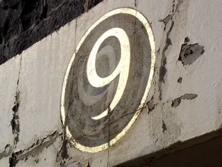
The other day I happened across these hand-painted numbers over the entry ways to the Melbourne Brewing & Malting Company’s Ale Stores.


There appears to be no door 1 or 2, and the number over 14 had been completely worn away, but the rest were there to be seen. I've posted a large image, so click on the link to view them up close. The numbers are spaced across the two horizontal white strips above the roller doors in the image below.


Erected in 1883, the building is just a shell now, but it’s on a large empty block that I imagine will be developed eventually. I’m sure the building will be worked into whatever development springs up, like the Shot Tower in Melbourne Central, but I can’t imagine these old numbers will survive.

I love a good bit of hand-painted lettering (and indeed, numbering), although to my eye the lower-half of the ‘8’ seems a bit squashed, like a tomato that’s been left out in the sun. Would’ve been a fun day’s work painting these, and the artist clearly loves a good 3D effect. Although I can’t quite work out what’s going on with the sort-of white shadow beneath the relief. Almost looks like an even older set of numbers than these ones were painted over?

Despite their worn state, the gold paint still gleams, and when the angle was right the winter sun really made them sparkle. Who needs backlit signage when you’ve got the sun and a specific angle at a certain time on a cloudless day?


If any sort of development gets underway I’ll post an update, so stay posted. Although not too posted, because I don’t imagine anything will happen soon. And, to be honest, when it does it’ll most likely just be a photo of newly applied whitewash anyway, so… you know, can’t wait for that one.

UPDATE (12/12): Well, there's movement at the station! Or an announcement, at least. RMIT has sold 1.6 hectares of the old CUB site to Grocon, and retained 0.3 hectares for the development of their own "significant and innovative academic building". As predicted, Daniel Grollo pledged, “The heritage aspects of the old Malthouse building and the bluestone facades fronting Bouverie Street will be incorporated into the development," but made no specific mention of the old hand-painted numbers. Surely an oversight? The article also says the CUB brewery was demolished in 1989, and RMIT bought the site from the government of Nauru in 1998 for $25 million (which is a lot of Student Union fees).

Here's a picture of the site as of October 2006. Mr Google, please let me know if I'm infringing your copyright by reproducing this image here. It's still on your servers, so it hasn't moved too far from home. Yours sincerely, etc, etc.

Friday, June 09, 2006

Typecast

The other day I was chatting with JJ, and I told him that I felt like I’d been neglecting ‘My Type of Blog’ lately and that it was time for another post. He asked (because he’s a clever-bottom) if it would be an anti-dog post because that seems to be all I can write these days.

Showing great forbearance, I told him ‘no’ because I didn’t think type and dogs really related to each other. He started rambling on about how anti-dog posts didn’t fit on a cat-blog either (um, earth to JJ, hello?) and blah, blah, blah, but I’d already stopped listening because he’d just given me an idea…


Well there’s type on it, isn’t there? I love this sign; with its fading and its rust, and its little painty/stickery/whatevery thing that it looks like someone’s used to try and obscure the ‘NO’ with. Fight the power, brother (or sister). I also really love the stylized dog. Classy little illustration. And on-topic, I can even tell you the font is Folio Bold Condensed. I thought it was some sort of condensed Helvetica at first, but the counters didn’t seem right. I only have Helvetica Black Condensed, so I assumed it must have been an Ultra Condensed version, but someone at Typophile suggested Folio, and they were right. It’s not a typeface I’ve had anything to do with before. Here’s a comparison for you if you’re interested. If you’re not, close your eyes, lower your chin a nad, then open them again and continue. Nice.


I’ve got quite a collection of ‘No Dog’ signs that I’ve taken over the years. I’ve often felt like I should do something with them, but I’ve never known what. Looking at the sort of fonts they use seems like as good a thing to do as any? So here’s another one for you.


These two images are somewhat mysterious. I stumbled onto them while wandering through the images on my Mac a while back. I did not take them, I have no idea who did, and I have no idea how they got onto my computer. All I know is that ‘City Walls’ was taken on June 6, 2004, while ‘Perros No’ (Spanish for ‘No Dogs’) was taken on October 13, 2004, and that they were both taken with a Canon IXY Digital 500. As it’s the same model of camera, I assume they were taken by the same person, most likely on the same trip. I suspect that ‘City Walls’ was taken in England, so ‘Perros No’ may well have been taken in Spain. Although four months is more than enough time to travel to any number of Spanish-speaking countries, even by boat.

I can only assume that someone thought of me when they saw the signs (I’m flattered), took a quick shot, and then passed them on, but I cannot remember who it was. If it was you, let me know, won’t you?

Well, sleuthing for a phantom photographer has even less to do with type than dogs do, so I might leave it there. Until, of course, I’ve had time to delve into my photo albums to dig up some more images to add to these two. Hehe. Bye for now.

Monday, April 10, 2006

Rushall Muse

Anyone got any comments on this picture?

Saturday, March 11, 2006

Typo Tour: Nuttelex

In Richmond we stopped at the home of my margarine of choice: Nuttelex.


Not only the only margarine that isn’t grey before colour is added (according to a checkout chick that my Mum was chatting to once), it also has the best logo of any margarine out there: a little squirrel with a satchel and cap. I love anything that gets around with a satchel. And a cap. Although I’m not sure why s/he needs either? A satchel would come in handy when you’re out collecting nuts, I guess, but it looks more like he’s heading off to school than out to forage for food. And the nut he’s leaning on wouldn’t fit in his satchel anyway.

I’m not sure what typeface they’ve used for ‘Nuttelex’. The X is very distinctive, but the only font I could find with a similar one was Clarendon Bold Expanded, and it clearly isn’t that.

I was also interested in a small sign by the roller door.


For some reason the ‘R’ in ‘Beware’ has gone missing. Maybe due to a similar problem as that of the zookeepers in Pete & Dud’s ‘Topical Fish’ sketch, who complain that in the winter their Rs keeping blowing off? Whoever got the job of fixing the sign has apparently been unable to find another regular Helvetica ‘R’, but was able to scrounge up a bold ‘R’ from Helvetica Condensed. It’s only a slight touch, but it gives the sign a more personable feel that I like.

I also like how you’re being warned to beware of - not just any trucks - but specifically Frize trucks. People just wouldn’t have taken a warning about trucks seriously, but FRIZE trucks, well why didn’t you say?! That missing F adds weight to the warning, as though it failed to heed the sign’s message and paid the price. The careless glyph has been carted away, but a grey stain of metallic blood remains as a cautionary tale of misadventure. Actually, with just the O there, the message seems like some ol’ sea dog’s warning, “Arrr, set sail if ye will, but mind ye beware o’ Frize Trucks!”


Around the corner of the building is a brightly backlit collection of fonts, including Herb Lubalin’s geometric, slab-serif ITC Lubalin Graph Bold (1974), Eric Gill’s Gill Sans Extra Bold (1931), and what is most likely a hand-drawn painters’ script that has been made into a sign. If you like that style of script, a whole swag can be found for purchase here and here.

Tuesday, January 10, 2006

Typo Tour: Melbourne Sporting Precinct

One spot not on the Typo Tour was the Rod Laver Arena. Surprisingly. Not. I love a good bit of Futura, (with the exception of the Extra Bold), but I’ve never liked the signage for the Rod Laver Arena; and not just because it’s got ‘Rod’ in it. Though that doesn’t help.


The Extra Bold ‘Laver’ knee-caps the whole thing before we’ve even started. Look at it. It’s like a big ol’ beached whale, too bloated and heavy to haul itself back into the water.

I find the negative spaces around the three ‘A’s and after the ‘V’ to be awkward and jarring, disrupting the rhythm of the letterforms. And like bark peeling off a tree, the ‘Arena’ looks ready to come adrift and just fall apart.

You could possibly improve things by increasing the space between all the letters, but mostly I think they should have just chosen another font. And name. I liked Melbourne Park. I thought it was fine for both the complex and centre court. Nothing against Our Rod - he could hit a ball really well apparently - I just prefer another name over his.


Anyway, we didn’t stop at the Rod Laver Arena on the Tour, but we did pass it as we drove through “Melbourne’s Sporting Precinct” on our way to Richmond. As we passed the MCG off in the distance, someone commented on its lack of visible signage. There was nothing to see at all. In fact, the MCG itself was actually quite hard to see (above). I guess that during the day the structure is so large it’s hard to miss, and when there’s a game at night, well, you can see the glow from the moon, but given the extent to which the Rod Laver Arena and the Vodafone Arena are lit up, even when they’re not in use, it struck us as odd that the MCG didn’t have so much as a single bit of visible branding.


I didn’t think anyone missed an opportunity for self-promotion these days. Maybe the MCG’s reputation and stature is such that it doesn’t need something as low and crass as artificially illuminated signage? Maybe to name “it” would be to diminish “it”? Whatever “it” is? It’s certainly one of Melbourne’s most well-known icons. Whatever the reason, I kind of like it. It seems kind of dignified, or something. It doesn’t scream at you; just gives a quick nod of the head as you pass in the hallway. Almost like it’s one of those inner-city bars, tucked away down an alley with nothing but a small name plate over its door to indicate where it is. Except the MCG covers several city blocks and attracts tens of thousands of people… but apart from that it’s the same. Sort of. You’ll find it if you want to go. Nice.

Sunday, October 16, 2005

My Type of Mum


A couple of years ago I got a birthday card that came in this envelope with my name in hand-rendered type. The question down the bottom in my Mum's handwriting reads, "Do you know this font? I think it's called The Fat." I love it.

Typo Tour: Nylex Plastics

At 7:24 on the morning of June 29, 2005, after 14 months of restoration costing $300,000, the Nylex clock was back on! And jammed. Time was standing still. Some sort of computer error. Fixed eventually, but now, mere months later, like some dodgy string of blinking globes around a Milk Bar sign, it's already lost lights again. Nylex's promise of "Every Time" now reads "Ever Time", which I find kind of amusing. Not as amusing, of course, as the time that I saw a glowing Red Rooster sign where the light had gone out in the 's', but "You'll tell the grandkids" experiences like that only come along every so often! In addition, the outlined 'N' in Nylex is also missing in action, so $300,000 well spent then.


I've never quite understood the appeal of the Nylex clock. I don't understand why it holds such a special place in the hearts of the community. It’s just a piece of corporate signage, isn’t it? Very old corporate signage, sure, but corporate signage none the less. It’s a nice treatment of the Nylex logo, with the lights and all, but if McDonalds or Nike rendered their logo in lights and bunged it on top of a silo for 44 years, would people be as enamoured? What's so special about Nylex? Do people just love their plastics so much that they now view Nylex as family? I guess people could love it because they've grown up with it as a part of the landscape, and now it's an icon of their childhood, or years gone by, or something?

So, what about the old Foxtel sign that used to sit below the Nylex clock? People hated that Foxtel sign. They weren’t even impressed by its enormous size, which you would have thought would count for something, given our love of Big things here in Australia. If the Foxtel sign had stuck around for 44 years, would opinions have changed? Would it have worked its way into our hearts, to the point that the general public would’ve been happy to pay to have it maintained? Would people view it with the warmth of nostalgia, and speak of it fondly like an old friend? Why is Nylex better than Foxtel?

Incidentally, the Foxtel sign was the largest sign in the Southern Hemisphere, and so bright that at night it lit up the rooms of the houses opposite it like day time. A friend of mine who worked for Foxtel told me that the residents took the company to court over the sign and its nova-like brightness. Telstra eventually came to an out-of-court settlement where they supplied every affected home with new, extra thick curtains! Creative thinking.

So Foxtel didn't last but Nylex is still there. Maybe it's because Nylex is representative of our inner suburban, working class roots? It represents all the factory workers who lived and toiled in Richmond before it became fashionable and expensive? The sign doesn't represent a company and its products, but a local narrative of hard work and hard conditions. Could be; it's not a history I can say I know much about.

Tuesday, October 11, 2005

Roadwork on the right

There's a road sign on the way to Ballarat that's always caught my eye, and on the weekend I finally stopped to get a photo.


I've never seen a Roadwork Ahead sign where the text is aligned on the right! How good is it?! I love it. And before you start stomping around in your size 12s, I'm well aware that it's just a normal sign with the "1km" removed, but take a second to dream with me, won't you? I think all road signs should be like this. I think this sign creates a sense of movement and of being on the road. Although maybe in this case the message should be to slow down, so centred would be better, but where the message is about speeding off, let's go for right alignment! Much more dynamic, lovely sense of movement. Might be confusing for right to left reading cultures, but it is in English, so if they don't know English it'll be confusing anyway. So no harm done. Right alignment. Good one.