Friday, July 28, 2006

Kern, baby, kern

“Anyone who says money can’t buy happiness, doesn’t know where to shop” is not a sentiment I ever felt inclined to agree with… until I stumbled across Veer.com and their decidedly tasty ‘Kern’ zip-up.


A ‘kern’, (in case you’re unaware) is a ‘light-armed Irish foot-soldier’, a definition which relates to the KERN on my top in absolutely no way at all. ‘Kern’, in this finely-stitched, twill appliqué context, relates to the act of manually adjusting the space between letters, so as to create even optical spacing across a word, as helpfully demonstrated by our attractive (trust me) model below. (And have I been taking crazy pills or is my top better kerned than the one on the female model above? I certainly think so.)


Letters don’t overlap, by default, as each character sits within its own little rectangular box, somewhat like letter tiles in Scrabble. This works well enough with letters that fill their space, but, as you can see in the example below, when letters like ‘V’ and ‘A’ sit next to each other, large negative spaces are created that cry out to be closed up.


And if I’d been workin’ on that plastic bag, I’d have been happy to oblige, as kerning is one of my Top 10 favourite things. Hence my excitement over my zip-up top that since it arrived has yet to make it to the wash. I mean, what if I need it and it’s not yet dry?! Come on. Kerning’s just so satisfying. It’s like scratching an itch, or getting that piece of apple peel out from between your teeth. Not kerning is like putting up a picture and not worrying about whether it’s hung straight. Clients don’t like kerning as it takes time and who the hell cares? “You can still read the word ‘VACUUM’ can’t you? Get it to print, Princess!” Bunch of savages in this town. Every town.

The really great thing about this top is that for the first time in my life I’m having conversations about kerning that haven’t been started by me! People see the word and just have to ask what it means, which, while I have no complaints, I do find somewhat surprising. I would have expected people to assume it was just some brand like 'FCUK' or ‘GAP’, and not even think to ask, but they do.

Incidentally, ‘Godfreys’ in the sample above is set in ITC Serif Gothic Heavy, designed by Herb Lubalin and Antonio DiSpigna in 1974, and ‘The Vacuum and Cleaning Specialists’ is ITC American Typewriter, designed by Joel Kaden and Tony Stan, also in 1974. (Maybe Godfreys has a thing for 1974?) ITC Serif Gothic, (if you're thinking it looks familiar) was also used for the Style ‘A’ poster for a little film that was released three years later in 1977. Star Wars and Godfreys. There can’t be many other things those two have in common? Oh wait, I can think of link between the prequels and vacuum cleaners! But besides that…?

Thursday, July 13, 2006

Their days are numbered

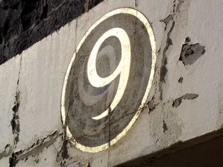
The other day I happened across these hand-painted numbers over the entry ways to the Melbourne Brewing & Malting Company’s Ale Stores.


There appears to be no door 1 or 2, and the number over 14 had been completely worn away, but the rest were there to be seen. I've posted a large image, so click on the link to view them up close. The numbers are spaced across the two horizontal white strips above the roller doors in the image below.


Erected in 1883, the building is just a shell now, but it’s on a large empty block that I imagine will be developed eventually. I’m sure the building will be worked into whatever development springs up, like the Shot Tower in Melbourne Central, but I can’t imagine these old numbers will survive.

I love a good bit of hand-painted lettering (and indeed, numbering), although to my eye the lower-half of the ‘8’ seems a bit squashed, like a tomato that’s been left out in the sun. Would’ve been a fun day’s work painting these, and the artist clearly loves a good 3D effect. Although I can’t quite work out what’s going on with the sort-of white shadow beneath the relief. Almost looks like an even older set of numbers than these ones were painted over?

Despite their worn state, the gold paint still gleams, and when the angle was right the winter sun really made them sparkle. Who needs backlit signage when you’ve got the sun and a specific angle at a certain time on a cloudless day?


If any sort of development gets underway I’ll post an update, so stay posted. Although not too posted, because I don’t imagine anything will happen soon. And, to be honest, when it does it’ll most likely just be a photo of newly applied whitewash anyway, so… you know, can’t wait for that one.

UPDATE (12/12): Well, there's movement at the station! Or an announcement, at least. RMIT has sold 1.6 hectares of the old CUB site to Grocon, and retained 0.3 hectares for the development of their own "significant and innovative academic building". As predicted, Daniel Grollo pledged, “The heritage aspects of the old Malthouse building and the bluestone facades fronting Bouverie Street will be incorporated into the development," but made no specific mention of the old hand-painted numbers. Surely an oversight? The article also says the CUB brewery was demolished in 1989, and RMIT bought the site from the government of Nauru in 1998 for $25 million (which is a lot of Student Union fees).

Here's a picture of the site as of October 2006. Mr Google, please let me know if I'm infringing your copyright by reproducing this image here. It's still on your servers, so it hasn't moved too far from home. Yours sincerely, etc, etc.